How to Prepare Artwork for Scodix Enhancement on Custom Packaging
A technical guide to Scodix artwork preparation: building the enhancement layer, choosing elements for raised coat, small text limits, foil sequencing, production proofing and physical sample approval for custom packaging.

A Scodix enhancement adds raised varnish, cold foil, and embossed texture that a flat screen cannot predict. The difference between a premium rigid box and a disappointing one is decided long before the press runs — at the artwork stage. As a custom packaging manufacturer that produces cosmetic and perfume boxes with hot foil, spot UV, and embossing, BOYU LUXE PACK sees the same preventable problems repeat across projects every month. This guide explains the logic behind Scodix artwork preparation so brand teams can brief their supplier with confidence.
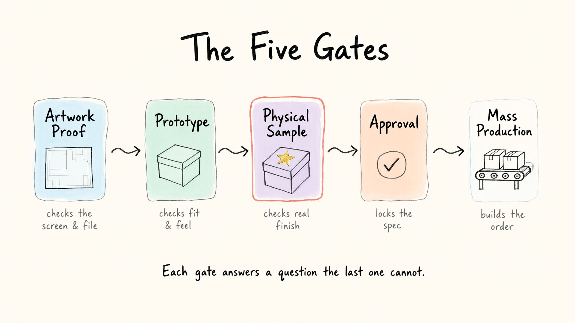
The core principle is simple: enhancement is a separate layer, not a visual afterthought. A file that looks complete for printing can still be unusable for digital enhancement. The sections below follow the order a production team actually works in.
Build the Enhancement Layer as Its Own Map
Scodix and comparable digital enhancement systems read a dedicated layer that tells the engine where to deposit material and how thick to build each spot. That layer is usually supplied as a grayscale or spot-color map placed on top of the print artwork and registered to the final dieline.
Three rules carry most of the outcome. Keep the enhancement geometry in vector paths, never flattened bitmap. Raster edges with anti-aliasing blur the boundary the engine follows, and the raised coat then spreads into detail the design meant to keep crisp. Name each layer after its effect, so a spot meant for gloss does not get applied as embossing. And deliver in layered PDF or native AI, where the press operator can isolate, reposition, or suppress a single effect without opening the whole layout.
The reason Scodix behaves this way is that it is a digital, die-free system. A conventional emboss needs a metal tool cut to the shape, which forces a clean solid boundary. A digital build reads tonal values directly, so the quality of the file is the quality on the box.
Pick Elements That Carry a Raised Coat
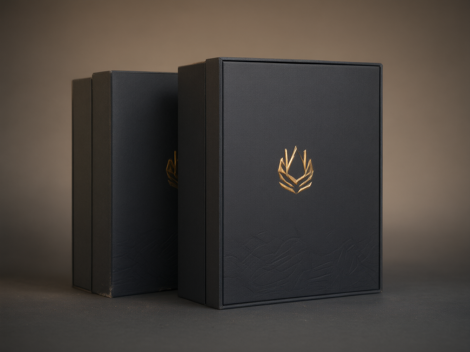
Enhancement earns its cost where it adds contrast — a surface that catches light differently from the area around it. The elements that read best are solid brand marks, monograms, product silhouettes, large graphic fields, and line work with enough stroke weight to hold its shape under a coating. On a 1200gsm rigid box with an art-paper wrap, a thickened logo against a matte background gives a tactile signal a buyer feels on the first touch.
Busy photographic detail and large areas of micro-texture do the opposite. The raised layer flattens fine tonal gradations into a single shiny sheet, and the eye reads mud instead of depth. The same logic governs gradients fading to nothing: the build height tapers to zero and the intended edge simply vanishes. Plan enhancement as negative space with deliberate high points, not as full coverage.

Treat Small Text as the Limit, Not the Goal
Thin type is where well-intended designs fail. A raised UV layer pools and rounds at its edges, so hairline glyphs, delicate serifs, and knockout text below a certain weight close up and lose legibility. This compounds on textured or uncoated stock, where the coating creeps into the paper grain.
The honest answer is that the safe floor for small text depends on the chosen effect, the substrate, and the production setup, not on the design file alone. A weight that survives a gloss-only pass can fail when the same copy is built as emboss with foil. The practical rule during Scodix artwork review is to keep every word that must be read at a comfortable size, and let enhancement decorate the brand mark rather than carry the copy. Exact minimum sizes for a given job get confirmed with the manufacturer before the layer is locked.
Plan Enhancement and Foil as One Sequence
Luxury packaging rarely uses a single finish. A perfume presentation box built on 1500gsm chipboard with a textured wrap commonly pairs a Pantone metallic with hot foil, embossing, and a Scodix gloss or cold-foil pass on top. Each added effect multiplies the registration demand.
The two failure modes are misalignment and layer conflict. A gloss or cold-foil layer that must sit over a hot-foil logo has to follow the same vector path within tight tolerance; if the two were drawn separately and drifted, the coat lands half on the design. Layer order is the second constraint: foil applied over a built UV emboss tends to bridge and lift at the edges, while a varnish over foil can dull the metallic, so the sequence gets fixed during design, not corrected on press. This is why a factory that already runs foil, spot UV, and embossing in-house can validate the combination faster than one that outsources each step.

Proof Against a Real Checklist
A digital contract proof shows color, which is one variable out of seven on an enhanced package. Production proofing checks a defined list on the actual chosen material: registration between enhancement and print; build height and tactile relief viewed at a raking light angle; gloss contrast against the surrounding finish; foil adhesion and edge scuff under a rub test; legibility of small elements; and color fidelity where CMYK meets Pantone inks.
One variable a screen cannot simulate is height. The same artwork can read as flat under direct light and as sculpted under an angled source, and the design intent lives in that tilt. Light-angle review is therefore part of the workflow, not a courtesy.
Approve a Physical Sample Before Bulk
A signed physical sample converts all of the above from theory into an agreed reference. Touch, gloss, and foil are the three things a buyer cannot evaluate remotely, and exactly the three the enhancement is supposed to deliver. Reviewing the real board with the real effect removes the disputes that surface after thousands of units ship.
BOYU LUXE PACK supports this stage directly: the factory provides free design support for layout and enhancement mapping, free samples on stock constructions, runs rigid and folding work from a low MOQ starting at 200 pieces, and ships to buyers in the USA, Europe, the Middle East, and Southeast Asia under a multi-stage quality-control process. A brand team that approves a sample up front protects both the launch date and the finish quality.

The Rule That Ties It Together
Exact Scodix artwork requirements get confirmed with the packaging manufacturer based on the selected enhancement effect and the production setup, because a safe minimum size, a workable layer order, and a realistic build height are properties of the combination, not of the file. Preparing the enhancement layer as a clean registered map, choosing high-contrast elements, keeping reading-critical text large, sequencing foil and build deliberately, and signing a physical sample are the five decisions every Scodix project should resolve before the dieline is locked.
Get a Free Quote
Send us your artwork, enhancement specifications, and target quantity, and we will return a structural recommendation, a finishing proposal, and a free quote for your custom packaging — backed by free samples and global delivery.
Interested in Custom Paper Tube Packaging?
Send us your specifications and get a detailed quote within 24 hours.
Get a Free Quote